CASE STUDY
The Age of Aerospace: an interactive video documentary
The Age of Aerospace: an interactive video documentary
Overview
CLIENT
Discovery Channel
Boeing
MY ROLES
Product Designer
Visual Designer
Motion Graphics Designer
PRODUCT DELIVERED
Website
The Age of Aerospace" is a documentary by The Documentary Group chronicling a century of aviation history, from the Wright brothers' flight to Mars missions. It highlights Boeing's role in aerospace history. As part of the creative services team at Discovery, I contributed to creating a web version of the documentary.
Goals
- Create an immersive, highly interactive video experience
- Allow users to explore topic related editorial content as video is playing
- Allow users to discover related editorial content via the menu
- Create intuitive navigation that allows users to find watched and unwatched episodes, and also video played progress
- Optimize experience for devices
- Reach out to millions of users via Discovery Channel properties
What I did
- Supported UX lead with information architecture strategy and content structurization
- Led design for content discoverability via video player progress bar
- Led design for the episode and chapter menu on the video player
- Worked closely with developers to design a custom video player with interactive timeline hotspots
- Developed a brand and UI style based on documentary visual treatment
- Supported visual design and art production
- Design and production of motion graphics and video editing
Impact
Nominated for the Webby Awards as one of the best video experiences for the year, the Age of Aerospace interactive documentary was a success. We were able to reach out to millions of users via Discovery Channel digital properties and raised awareness around the history of aviation with a unique digital experience. A great sample that advertising campaigns can educate as they create brand awareness.
An immersive interactive video experience from the start
An immersive interactive video experience from the start
The home page was designed to lead users into the first episode as soon as they landed. We added the list of episodes to the left to give users a quick idea of the documentary’s length. If a user revisited the experience, they could continue where they left off as the progress indicator around the play button displayed what’s left for that specific episode.
A progress bar with related content smart spots
A progress bar with related content smart spots
The video player was capable of serving related editorial content in different ways. We added hot spots to the progress bar that were activated via hover, or automatically as the progress blue bar reaches the location. A small container prompted users to discover more of the content with one click. As an alternative route, we added a gallery of the same content under the explore button at the bottom right.
Navigation
Navigation
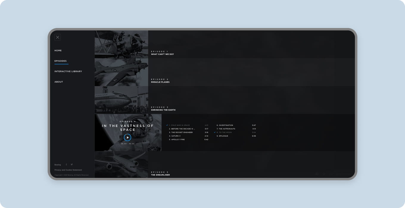
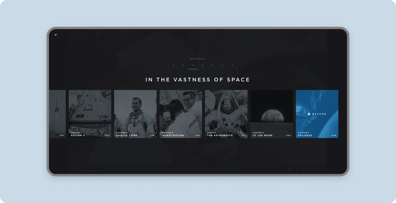
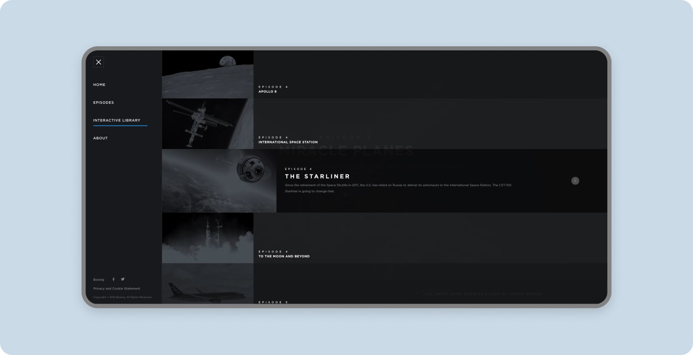
The experience was designed to engage users with the video content right away. However since there was a lot of interactive content we didn't want users to miss the chance to explore further, so we thought about navigation carefully. We decided to split episodes into different chapters which allowed us to display a list of topics inside the menu. Interactive topics were displayed as a list as well, allowing a user to discover interactive editorial content via the menu.
Interactive content
Interactive content
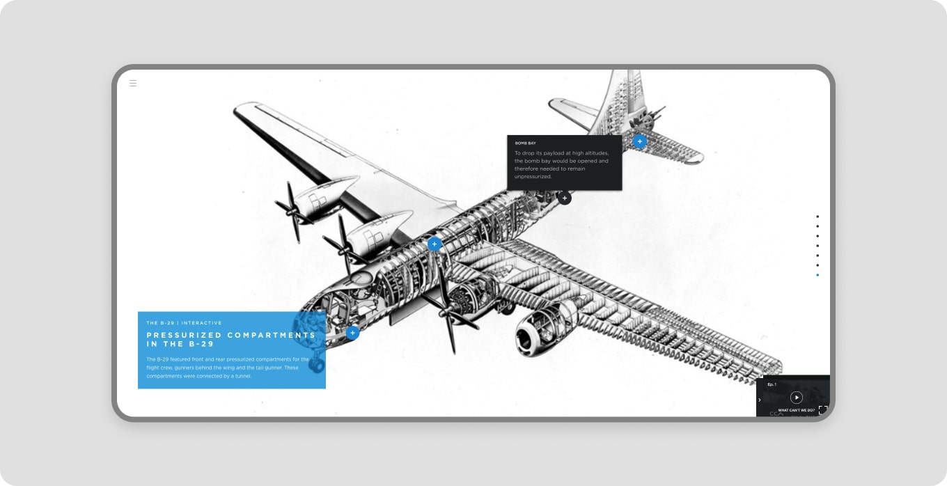
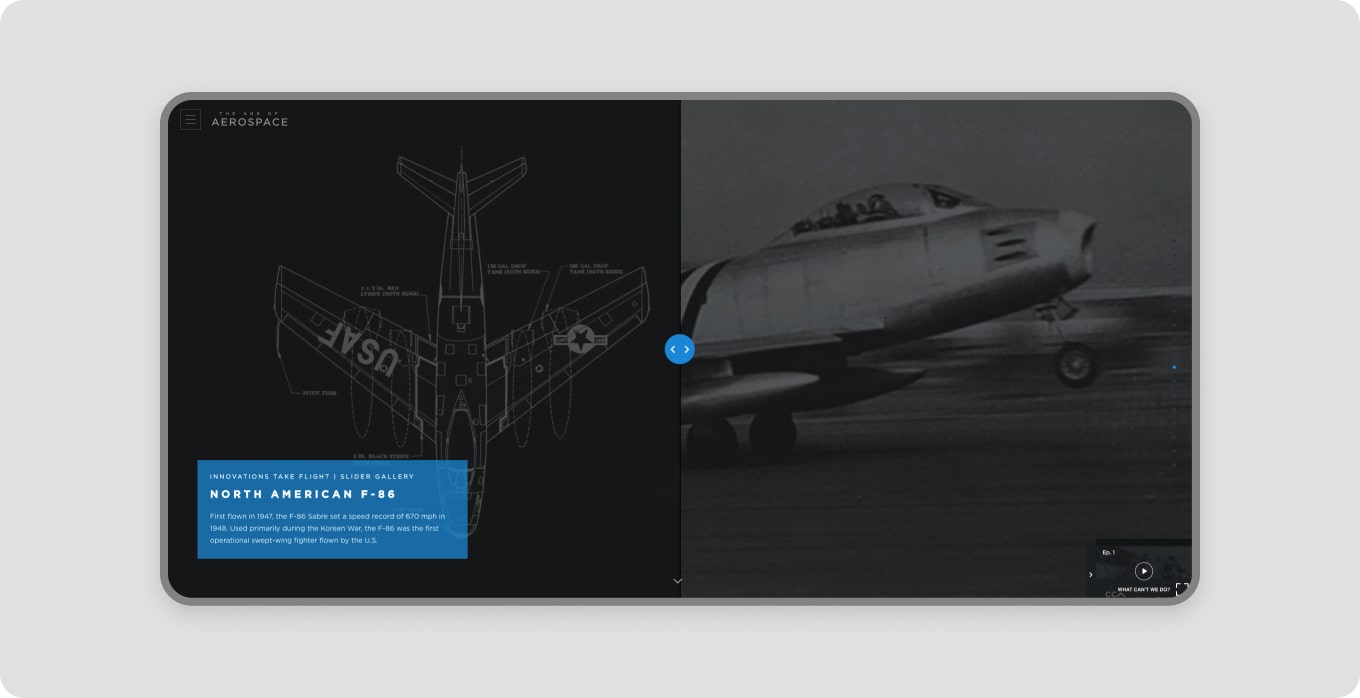
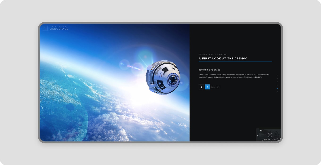
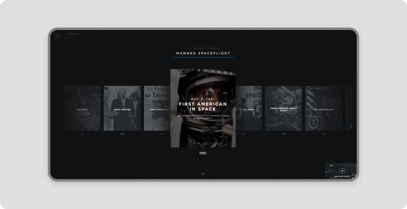
The team designed a variety of interactive components for editorial content. The idea was to make static content more engaging by adding interactivity and letting users explore and play as they discover new content.
Responsive
Responsive
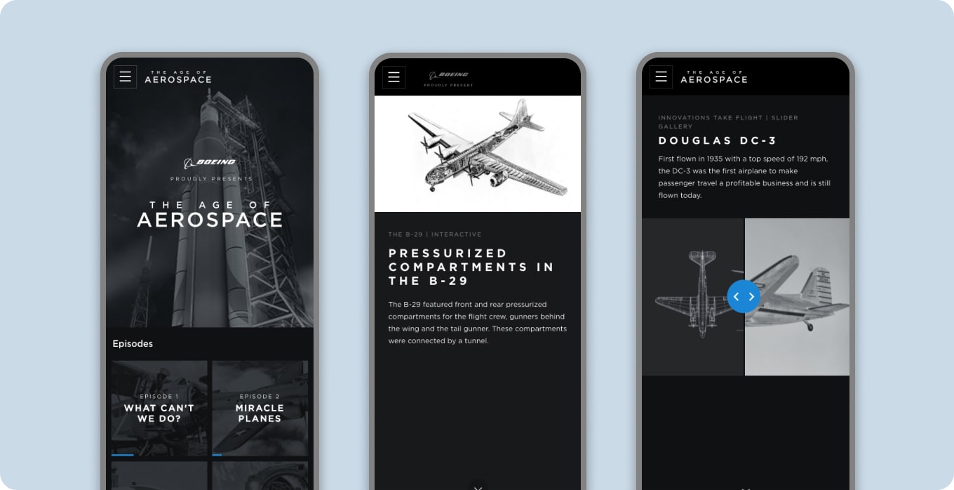
All video content and interactive content was fully optimmized for mobile and other devices
Have a project?
Let's talk.
Have a project?
Let's talk.
Have a project?
Let's talk.
Have a project?
Let's talk.
Gabriel de los Rios
Gabriel de los Rios
Gabriel de los Rios
Senior Product Designer
Lead Product Designer
Senior Product Designer